Clothing Product Photography: Keep Colors Consistent
A practical clothing product photography workflow for consistent color variants: lock the hero image, change one variable, and use a short QA review before publishing.
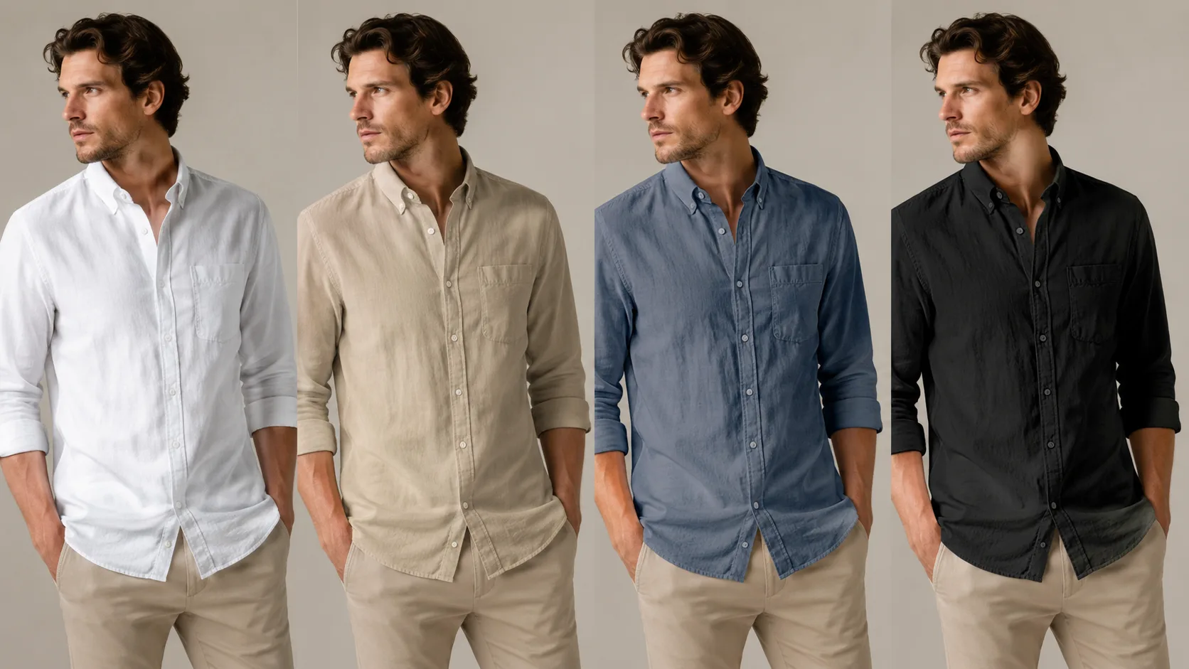
Good clothing product photography makes a color range feel like one product family. Start with one approved hero image, document the crop and lighting, then check each color variant for shape, texture, background, and shadow consistency before it reaches a product page.
Last updated: July 25, 2026 · about 5 min read
This is not an argument against a real shoot. It is a way to protect the work you have already paid for when one SKU needs several color options.
Lock the baseline before you make variants
Pick the image that best shows the garment’s silhouette and details. Treat it as the baseline for every later version.
| Lock this element | Why it matters |
|---|---|
| Crop and camera height | A different crop makes colors look like different listings |
| Background tone | Warm and cool backdrops change perceived color |
| Model pose or mannequin position | Keeps fit and drape comparable |
| Light direction | Preserves shadow placement and texture |
| Garment construction | Prevents a recolor from quietly changing seams or buttons |
The color may change; the visual evidence for the product should not.
Photograph one strong original
For clothing product photography, capture enough clean information in the source image that a buyer can read the garment: neckline, sleeves, hem, closure, and a believable amount of fabric texture. Avoid a pose that hides the exact area customers will compare across colors.
Then make a small reference note. It can be as plain as: “front three-quarter crop, soft light from camera left, warm-gray background, shirt fully visible, no text.” That note keeps a later reshoot or edit from drifting into a new style.
When a color preview can help
If you have one approved product image but need to plan or review another color direction, an AI clothes color changer can create a visual draft. Use it to compare direction, not to invent product facts. The original cut, buttons, print placement, and material finish still need human approval.
Make one controlled change per pass. Do not ask an editor to recolor the shirt, change the background, add jewelry, and alter the pose at once. When several variables move together, you cannot tell why the new version feels wrong.
Run a short color-variant QA check
Before publishing, compare each version beside the baseline at product-card size and at full size.
- Silhouette: Are the shoulders, sleeves, hem, and seams in the same places?
- Texture: Does knit, denim, satin, or print still read like the original material?
- Color boundary: Are collars, cuffs, buttons, and overlapping layers cleanly separated?
- Light and shadow: Did the change create a new shadow, highlight, or impossible reflection?
- Background: Is the background stable enough that customers are comparing the garment, not the scene?
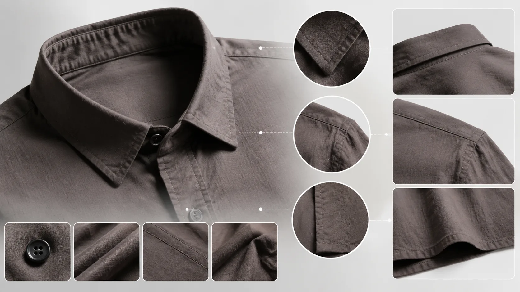
A fast side-by-side check catches most visual drift before customers see it.
Keep the customer-facing copy honest
An image can make a variant easier to browse, but it should not replace real product details. Keep material composition, available sizes, and the official color name tied to your product data. If an edited draft is still being evaluated, do not present it as a final catalog photograph.
For a more detailed handoff, use this clothing color variant QA checklist. For better source images, see how to photograph clothes for AI outfit edits. The practical goal is simple: each color should look like the same garment, photographed with the same standard of care.