Clothing Color Variant QA Checklist for Online Stores
Use this clothing color variant QA checklist before publishing AI recolored product photos. Check shade accuracy, fabric texture, shadows, edges, and return-risk issues.
Clothing color variants can help an online store show more buying options without arranging a full product reshoot for every shade. But a color variant is only useful if shoppers can trust it. If the fabric looks flat, the shade is misleading, or the edges look edited, the image can create more support tickets and returns than sales.
This checklist is for teams that use AI or editing tools to recolor product photos. It works especially well with a clothes color changer, because the goal is not just to create more images. The goal is to decide which images are safe enough to publish.

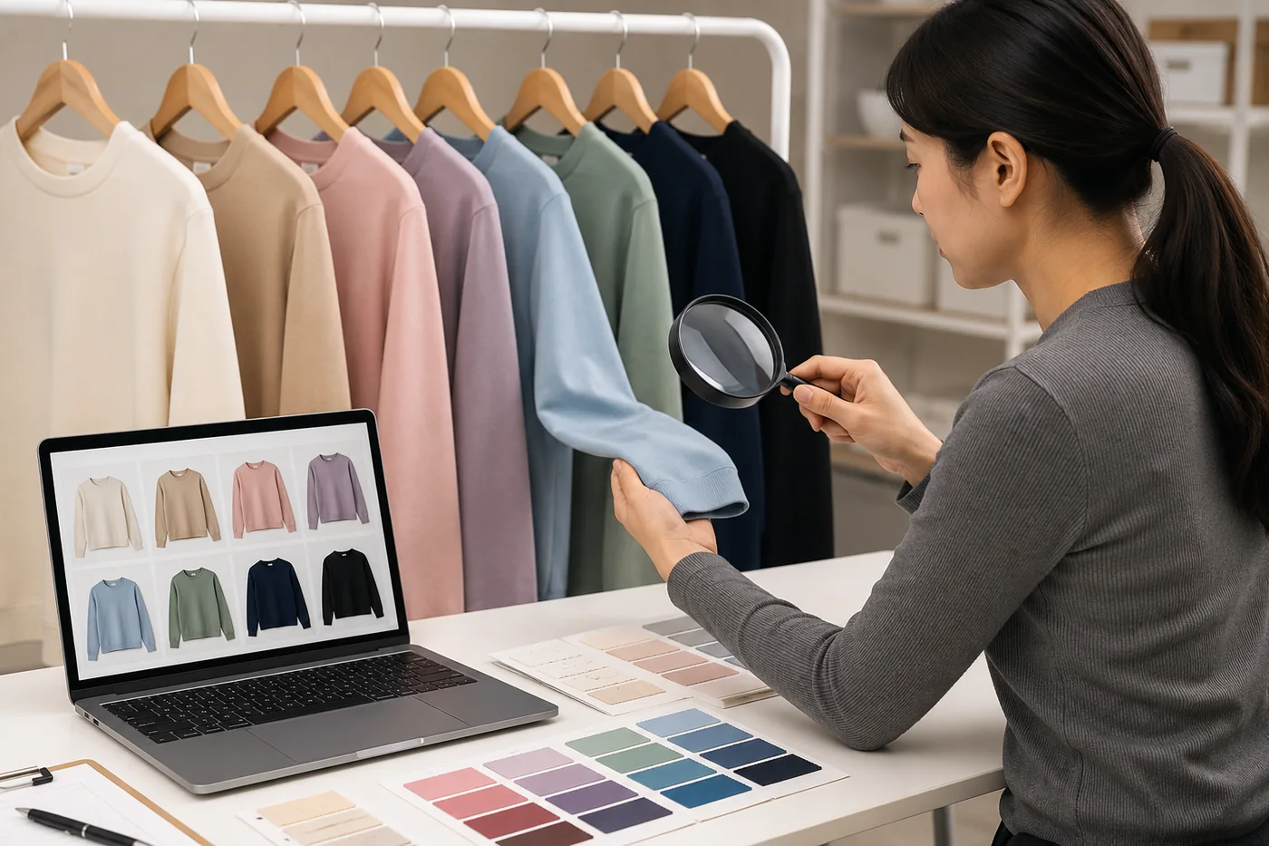
Concept visual: treat AI color variants like product assets that need review, not quick decorations.
Start With the Source Photo
Most color-variant problems start before the edit. A weak source photo gives the AI less structure to preserve. Use a photo where the garment is fully visible, the lighting is even, and the background does not blend into the clothing. Avoid heavy shadows, motion blur, filters, and low-resolution crops.
For a product photo, consistency matters as much as the recolor itself. If one variant uses a different crop, background, or brightness, shoppers may read it as a different garment rather than a different color.
If the same product is available in several colors, choose the photo with the clearest fabric texture as your base. A clean source makes it easier to compare colors later. The same rule applies if you are creating model images with AI clothing models for ecommerce: the better the input, the easier the QA pass.
Check Color Accuracy Against the Real Product
The first QA question is whether the generated shade is close enough to the real item. If the final garment is not manufactured yet, compare the image against the intended color standard or fabric swatch. If the item already exists, compare the AI variant against a real photo under neutral light.
Do not expect every screen to show color perfectly. The point is to catch obvious mismatches: navy that reads black, cream that reads yellow, olive that reads gray, or red that shifts into orange. If a color is hard to describe in one phrase, write a short note for the product page instead of relying only on the image.
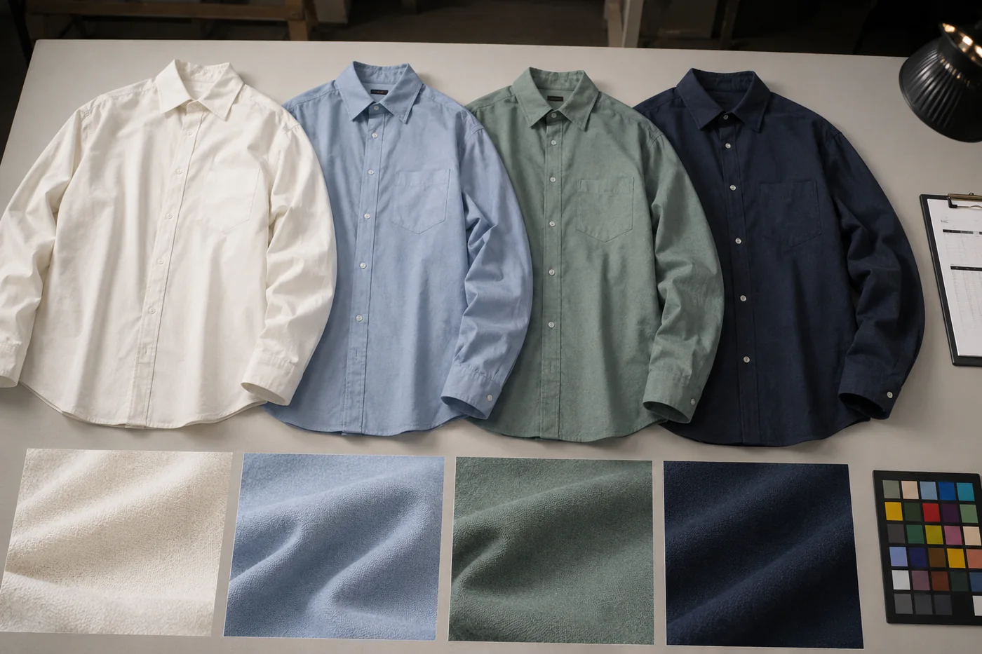
Review Fabric Texture and Material Behavior
A good clothing color variant keeps the original fabric behavior. Cotton should still look matte. Satin should keep a controlled shine. Denim should keep weave and seam detail. Knitwear should keep texture around folds. If the recolored image turns the garment into a smooth plastic surface, it is not ready for a product listing.
Texture matters because shoppers use it to judge quality. A flat color block can make a real product look cheaper. It can also make a synthetic AI edit obvious. Open the image at full size and inspect the highest-detail areas: collar, cuffs, seams, pockets, waistband, buttons, and hems.
Inspect Edges, Hands, Hair, and Accessories
Color bleed is one of the fastest ways to spot a weak edit. Look anywhere the garment touches another object. Hair crossing a jacket, fingers on a sleeve, a necklace over a top, a bag strap, or a belt can all confuse the recolor boundary. These details matter even if the preview looks fine at thumbnail size.
- Check whether the new color leaks onto skin, hair, jewelry, or the background.
- Check whether garment edges stay sharp where they should be sharp.
- Check whether folds remain natural instead of becoming painted lines.
- Check whether buttons, zippers, labels, and logos stay readable and unchanged.
Concept visual: compare variants as a set so one shade does not look sharper, flatter, or more artificial than the others.
Use a Publish, Review, or Reshoot Decision
Every variant should end in one of three buckets. Publish means the image is believable, consistent, and close enough to the product. Review means the image has promise but needs human cleanup. Reshoot means the color or material is too risky to simulate.
| Decision | Use it when | Next step |
|---|---|---|
| Publish | The shade, fabric, shadows, and edges all pass review. | Add alt text, compress the image, and publish with the product. |
| Review | The color is useful but an edge, seam, or shadow needs cleanup. | Send to a designer or rerun with a better source photo. |
| Reshoot | The fabric is glossy, transparent, patterned, or color-critical. | Plan a real shoot or use the AI image only as an internal preview. |
Keep Variant Sets Consistent
A single color variant can look good on its own and still fail as part of a set. Product pages often display variants together. If one image has different brightness, crop, pose, or background detail, shoppers may think they are looking at a different product. Keep the same base photo, crop, size, and lighting wherever possible.
The earlier guide on how to create clothing color variants without a product reshoot covers the workflow. This QA checklist is the filter you run after that workflow. It protects the listing from color drift, texture loss, and unrealistic expectations.
Write QA Notes That a Teammate Can Use
A good QA pass should leave a short record. Do not only mark an image as good or bad. Write what changed, what passed, and what still needs review. For example: "olive version keeps seams and shadows; collar edge needs cleanup" is much more useful than "looks okay." If another teammate opens the file later, they should understand why the image was accepted.
Keep notes short and repeatable. Use the same labels across the batch: shade match, fabric texture, edge bleed, accessory preservation, shadow realism, crop consistency, and final decision. This makes it easier to compare variants across products and categories. It also helps you see patterns. If every satin dress fails on highlight detail, the issue may be the fabric type, not the prompt.
Use Alt Text and Page Context Honestly
When a variant is approved, give it alt text that describes the product and color clearly. Do not describe an AI-generated variant as a real photoshoot if it was not one. A simple phrase like "navy ribbed knit top color variant on model" is more useful than a vague phrase like "beautiful shirt photo." Honest labels help search engines, screen readers, and internal teams understand the asset.
Also make sure the product page text supports the image. If the shade is approximate, use product copy that says what the shopper will receive. The image should help a shopper choose. It should not carry the entire burden of explaining material, fit, lighting, and color.
Bottom Line
AI can make clothing color variants faster, but quality control is still the difference between a useful product image and a risky one. Check the source photo, shade accuracy, fabric, edges, shadows, and set consistency. Then decide whether each image should publish, go to review, or be replaced by a real reshoot.