
How to Preview Matching Outfits for Family Photos
Preview family matching outfits on your own photo before buying. Compare colors, patterns, dress codes, and photo-session palettes with AI dress up.
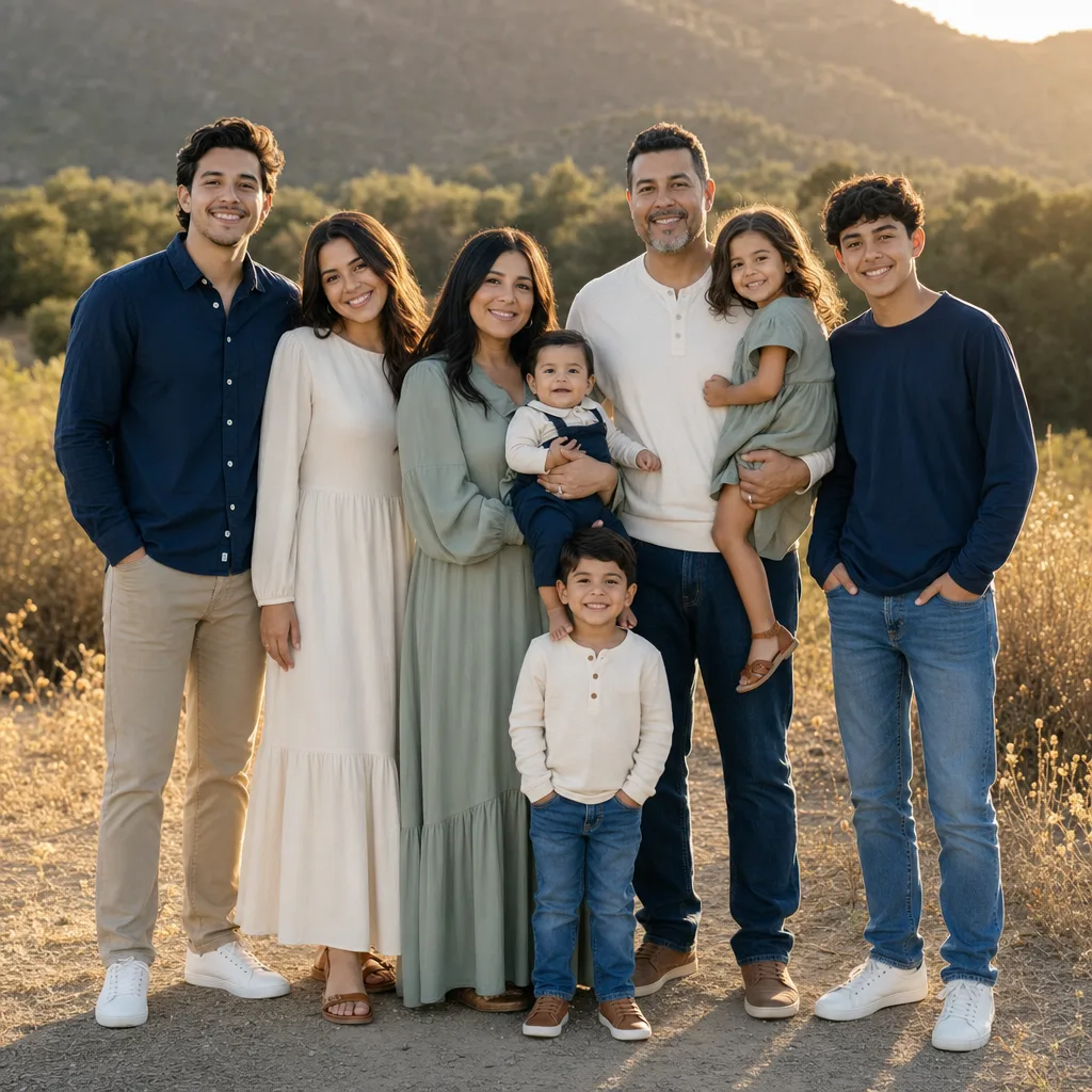
Family matching outfits look easy on a product page and much harder in a real photo. A set that looks cute online can turn too busy, too flat, or too matchy once different heights, skin tones, lighting, and background colors enter the picture. Before you buy, use AI dress up to preview the outfit direction on a real family photo.
Last updated: July 9, 2026 - about 7 min read
The goal is not to make everyone wear the same shirt. The goal is to make the photo feel coordinated without turning the family into one block of fabric.
Quick answer
For family matching outfits, start with a shared palette instead of identical clothing:
- One anchor color.
- One neutral.
- One accent color.
- One texture or pattern used sparingly.
Preview the set on the photo location if you can. A cream-and-sage palette may look soft in a garden and disappear on a pale beach. Navy and denim may look polished outdoors and too heavy in a dark indoor room.
Matching vs coordinated
There are two ways to plan family outfits.
| Approach | What it looks like | Best for |
|---|---|---|
| Matching | Same shirt, dress, pajama, or color on everyone | Holiday cards, playful shoots, themed events |
| Coordinated | Related colors and textures, different pieces | Portrait sessions, graduations, travel photos |
Matching is easier to shop. Coordinated usually photographs better.
If everyone wears the exact same color, the photo can lose shape. If every person wears a different loud color, the eye has nowhere to rest. A good family photo outfit sits between those extremes.
Choose the photo setting first
The background changes everything. Plan family matching outfits after you know the location.
For beach photos, lighter neutrals, linen, denim, soft blue, sage, sand, and white can work, but too much white may blow out in bright light. For fall photos, rust, olive, cream, denim, and brown can look warm. For city photos, navy, black, grey, ivory, and one accent color often feel cleaner. For studio portraits, simple shapes and fewer patterns usually win.
If you already have a location photo, use it. If not, choose an old family photo with similar lighting and crop. The preview will be more useful than judging outfits in isolation.
Build a four-part palette
A simple family outfit palette has four parts:
- Anchor color: navy, cream, olive, burgundy, denim, black, or brown.
- Neutral: white, beige, grey, tan, or soft blue.
- Accent: one stronger color that appears once or twice.
- Texture: knit, linen, denim, corduroy, lace, or subtle plaid.
Use the outfit color matcher approach if you need help building the palette. Pull one color from the background or from a piece someone already owns, then build around it.
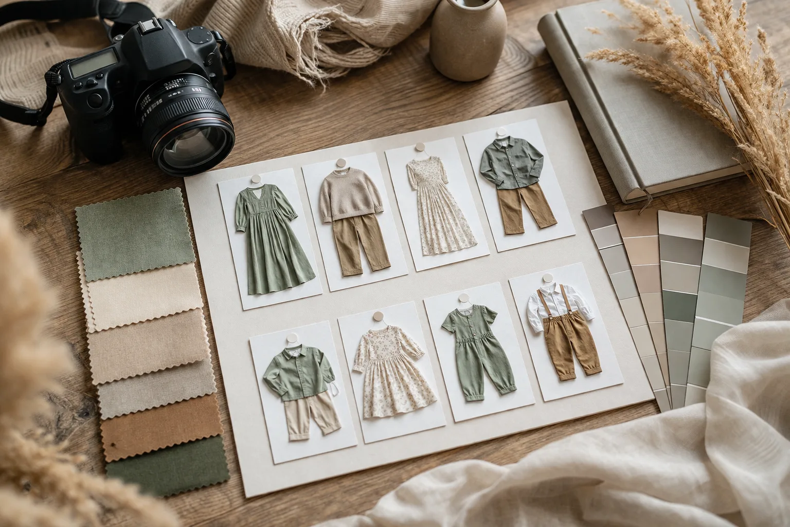
A planning board is useful because it separates palette, texture, and outfit role before you buy the pieces.
Give each person a role
A family photo works better when every outfit has a job.
- One person can wear the anchor color.
- One person can wear the softest neutral.
- One person can carry the accent.
- One person can wear the pattern.
- Small accessories can repeat colors without making everyone identical.
For example:
| Person | Outfit direction |
|---|---|
| Adult 1 | Navy shirt or dress |
| Adult 2 | Cream knit with denim |
| Child 1 | Sage top with neutral pants |
| Child 2 | Small plaid or stripe with navy/cream |
That set reads as coordinated, but each person still has a shape.
Preview before buying
Online shopping images usually show one model at a time. A family photo shows everyone together. That is the gap a preview can close.
Use AI dress up to test:
- Same palette with different clothing shapes.
- One matching set vs one coordinated set.
- Pattern on one person vs pattern on two people.
- Light neutrals vs darker contrast.
- Formal vs casual versions of the same palette.
You are not trying to predict exact size or fabric feel. You are checking whether the color and balance make sense in a photo.
Avoid the common photo mistakes
The most common family outfit mistakes are predictable:
- Too many tiny patterns.
- Everyone in the same dark color.
- White shirts against a very bright background.
- Neon colors near faces.
- Shoes that clash with the rest of the palette.
- One outfit that is much more formal than the others.
- Outfits that match the background too closely.
If something looks wrong in the preview, name the problem. Is the palette too flat? Is one color too loud? Is the pattern stealing attention? Fix one variable at a time.
How to prompt the preview
Keep the prompt practical:
coordinated family photo outfits, navy and cream palette, one sage accent, casual outdoor portrait style, realistic clothing, natural fabric, modest outfits, keep the same faces, pose, lighting, and background
For a holiday card:
matching family outfits for holiday photo, deep green, cream, and denim, subtle knit texture, cozy but not costume-like, realistic fit, keep faces and background unchanged
For a beach shoot:
coordinated beach family outfits, linen textures, soft blue, white, and sand colors, relaxed fit, natural daylight, keep the same people, pose, and shoreline background
Avoid asking for too many exact products. The preview is for direction: color, balance, formality, and mood.
When matching outfits are worth it
Matching outfits can be great when the photo is intentionally playful: holiday pajamas, birthday shirts, reunion tees, or a sports-family moment. If the goal is a timeless portrait, coordinated usually ages better.
If you are unsure, generate one fully matching version and one coordinated version. Compare them at thumbnail size. The better one is usually obvious.
Final checklist
Before you buy family matching outfits, check:
- Does the palette suit the location?
- Does every person still stand out?
- Is there only one main pattern?
- Are shoes and accessories included in the plan?
- Does the photo still look good when cropped?
- Does the outfit style match the event?
The right family outfits should make the photo feel calmer, not busier. If the preview makes the group look easier to read, you are probably close.
FAQ
Should family matching outfits be identical?
Not usually. Identical outfits can work for playful or holiday photos, but coordinated colors and textures often photograph better for portraits.
What colors are safest for family photos?
Navy, cream, denim, sage, soft blue, olive, burgundy, tan, and grey are usually easier than neon or very bright white. The best choice still depends on the background.
Can AI dress up show exact sizing?
No. Use it for visual direction: palette, formality, neckline, contrast, and group balance. Sizing and comfort still need real shopping or fitting.